
I have chosen to use a magazine layout from The Magnolia Journal. This is a publication focusing on the designs and lifestyle of interior decorator Joanna Gaines and her husband Chip. This couple have a popular show on HGTV where they focus on renovating rundown homes and making them beautiful and homey. I was attracted to the beautiful layouts in this magazine and felt this particular layout captures all of the elements of good design. Story by Liz Bell Young. Photography by Nick Kelley. https://magnolia.com/journal/
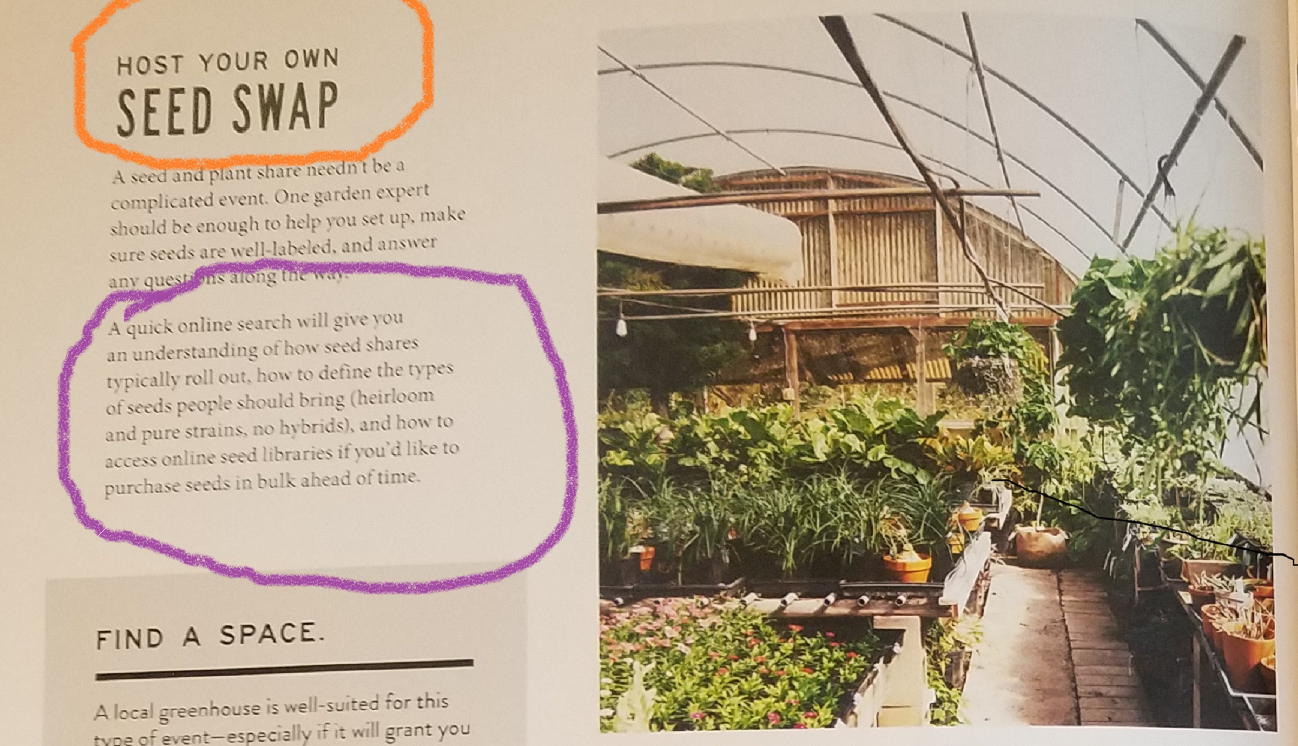
The two typefaces I can see in this layout are Sans serif, (circled in orange) and an Oldstyle Font, (circled in purple). Sans serif is identified by the lack of serifs on the end of the letter strokes. It is also identified as Sans serif because there is no visible transition in the strokes of the letters. The Oldstyle font is identified by a diagonal slanting of the serifs on the letters and has a moderate thick/thin transition in the strokes.
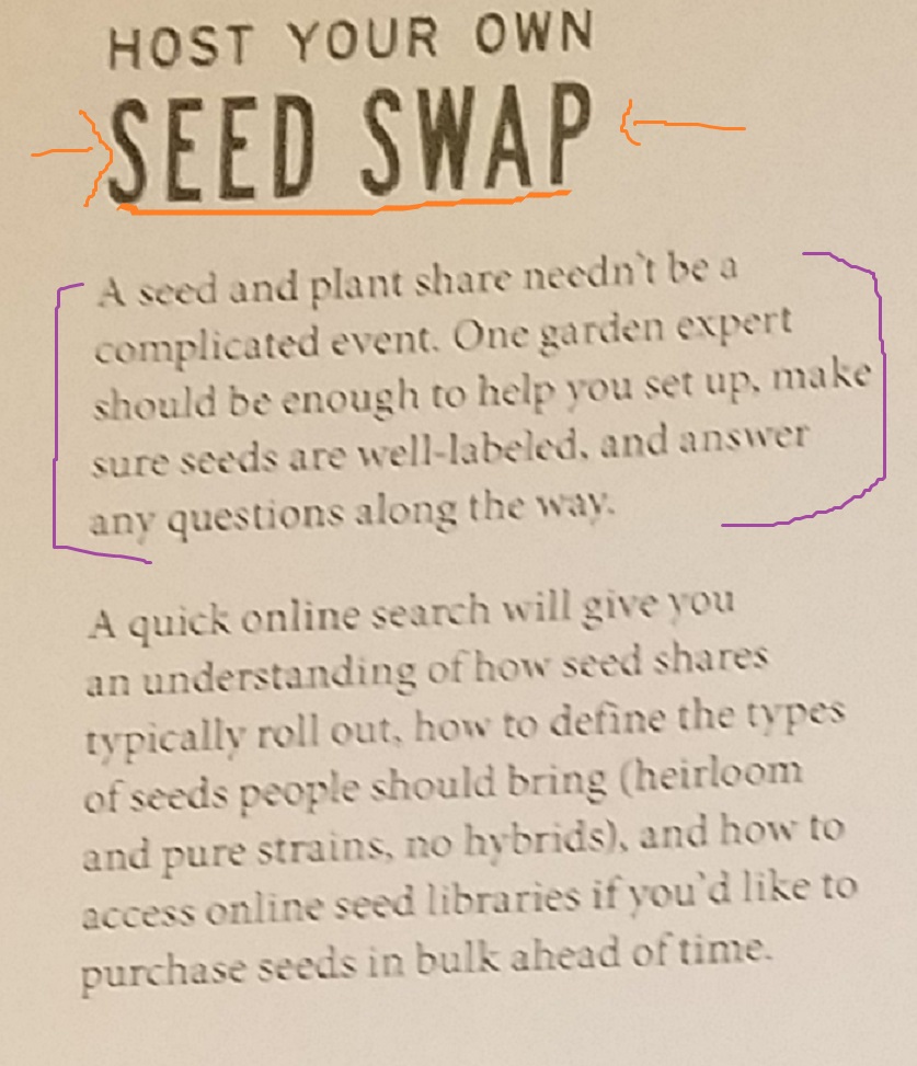
The San Serif typeface is a nice contrast to the Oldstyle typeface not just because of structure, but because of the weight of the typefaces. San serif font is larger and in bold, while the Oldstyle is smaller and not bold. This contrast adds interest to the page and follows the principles of good design.

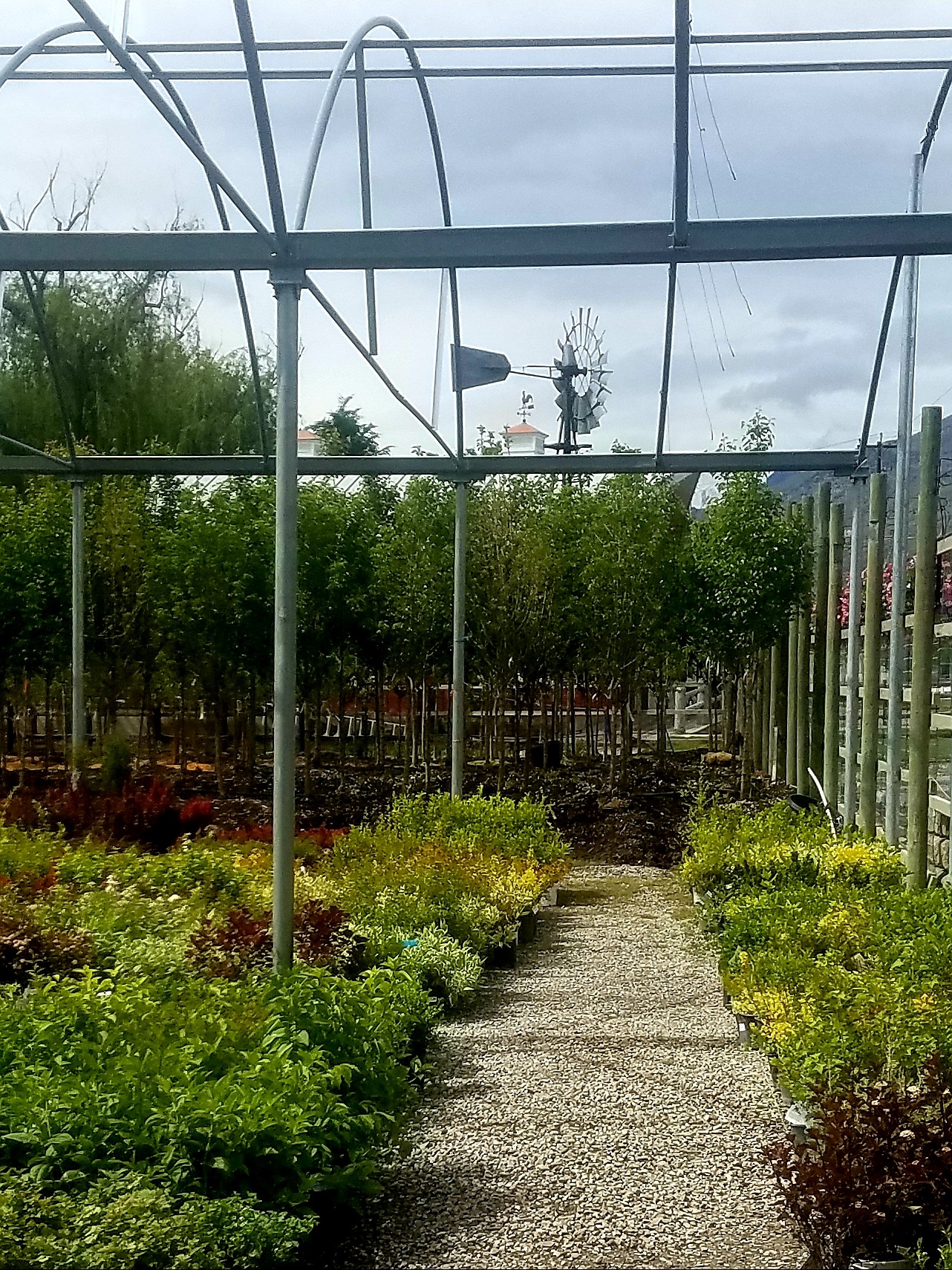
I chose this photo because the principle use of Leading Lines that is apparent. The eye is drawn to not only the plants in the photo, but also the interesting structure itself. The back wall covered in bamboo and the architecture of the greenhouse become a focal point because of the sight line, or path leading to it. Since the article is about seeds, I love that we have a photo of what actually grows from them.
Alternate Photos
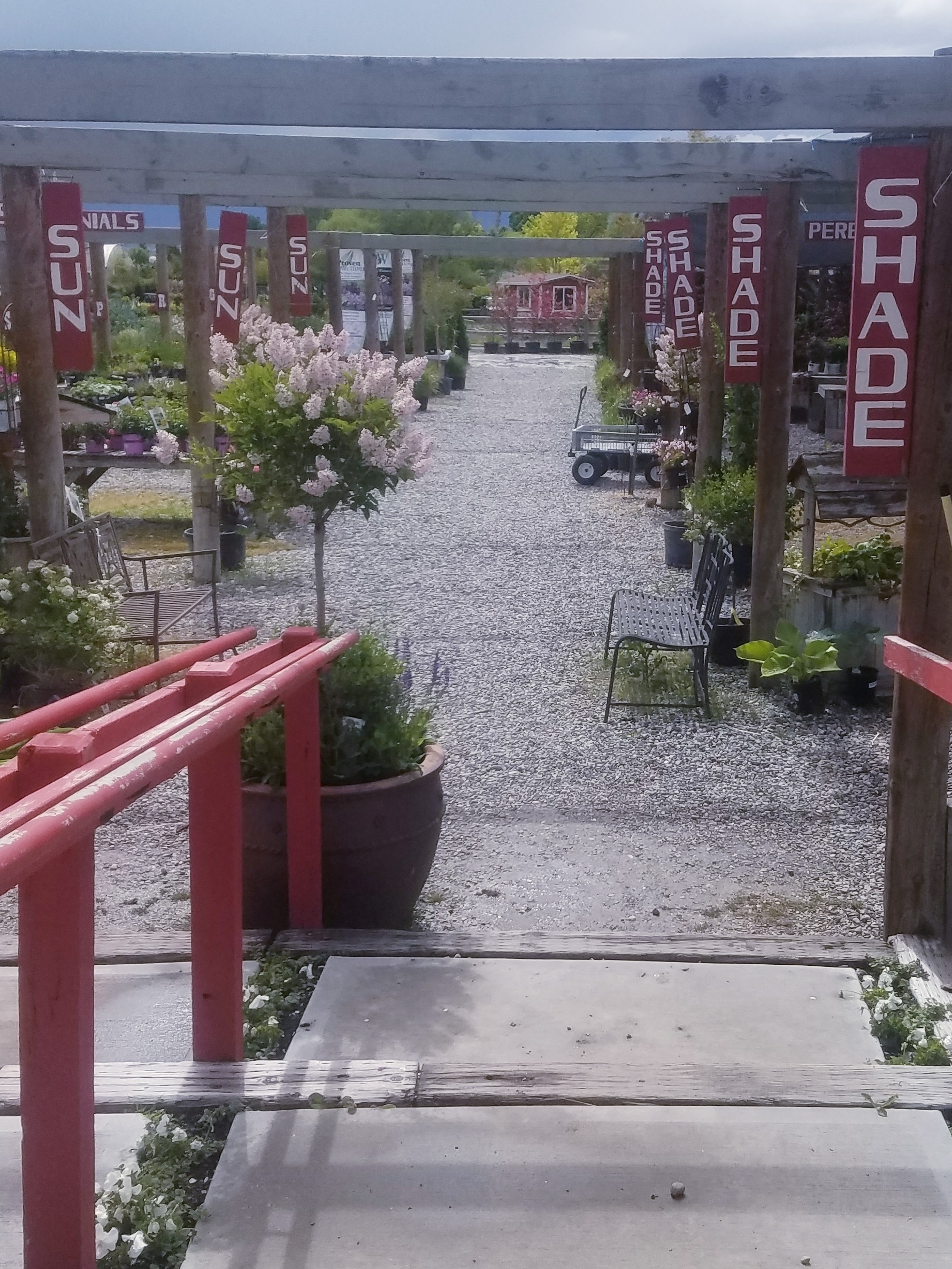
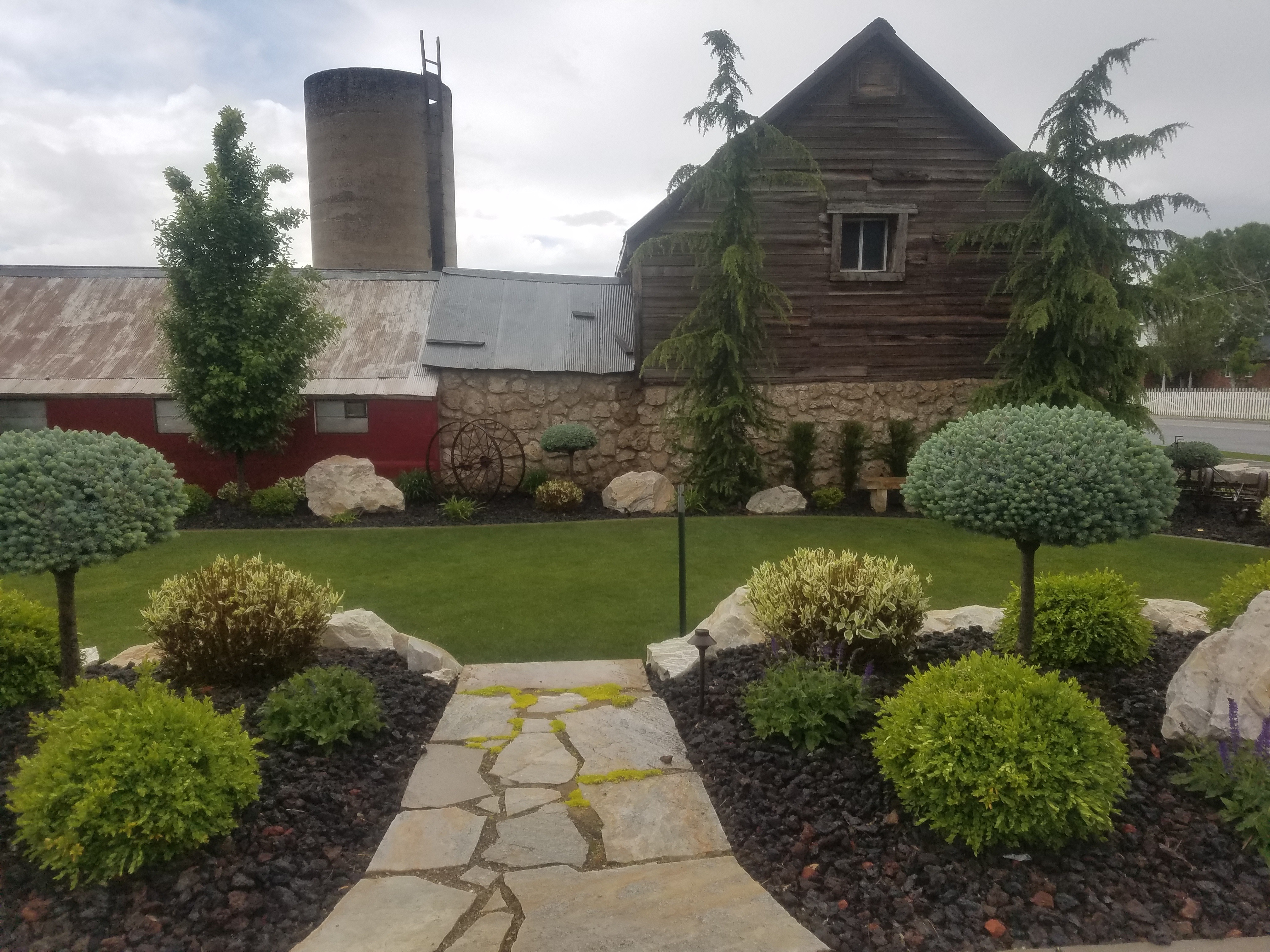
In the photographs I took to mimic the original, I tried to make sure I had very distinct Leading Lines in each picture. In photo #1, my goal was to show the distinct path into the nursery, with greenery on either side. I liked the wooden beams in this photo because I felt they mimicked the bamboo in the original photo. In photo #2, I just loved the structure of the barn and the distinct path leading the eye to it. I also loved how the beautiful plants and trees brought in the greenery/seed aspect to the photo. The rock on the wall and the weathered look of the wood on the side of the barn all gave me the same rustic vibe as the original photo. Photo #3 is my favorite of all three of my photos as the one that most mimics the original. The leading line path is similar and I tried to shoot it from the same angle as the original. The pole structure and the greenery feel like a close match to me. Lighting was a bit of a problem for me as we have had no sun all week, but overall I was happy with how the photos turned out.
Conclusion:
I enjoyed studying this magazine layout, because I was excited to find it covered the design principles we have been learning about this week. There were two different typefaces in the article that followed precise rules of which type works together as contrasting and not conflicting. Each of the photos had an element of good photography composition rules, such as, Leading Lines, Rule of Thirds, or Depth of Field. I was excited to see that this particular layout followed the good design principles so carefully.


