Featured

Magnolia Journal Design Critique

Principles of Design

I have chosen to use a magazine layout from The Magnolia Journal. This is a publication focusing on the designs and lifestyle of interior decorator Joanna Gaines and her husband Chip. This couple have a popular show on HGTV where they focus on renovating rundown homes and making them beautiful and homey. I was attracted to the beautiful layouts in this magazine and felt this particular layout captures all of the elements of good design. Story by Liz Bell Young. Photography by Nick Kelley. https://magnolia.com/journal/
San Serif and Oldstyle

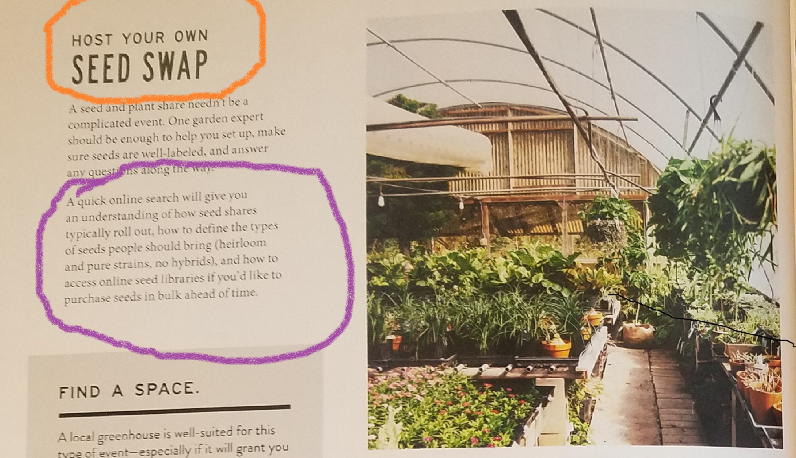
The two typefaces I can see in this layout are Sans serif, (circled in orange) and an Oldstyle Font, (circled in purple). Sans serif is identified by the lack of serifs on the end of the letter strokes. It is also identified as Sans serif because there is no visible transition in the strokes of the letters. The Oldstyle font is identified by a diagonal slanting of the serifs on the letters and has a moderate thick/thin transition in the strokes.

Contrasting Fonts

The San Serif typeface is a nice contrast to the Oldstyle typeface not just because of structure, but because of the weight of the typefaces. San serif font is larger and in bold, while the Oldstyle is smaller and not bold. This contrast adds interest to the page and follows the principles of good design.

Leading Lines

I chose this photo because the principle use of Leading Lines that is apparent. The eye is drawn to not only the plants in the photo, but also the interesting structure itself. The back wall covered in bamboo and the architecture of the greenhouse become a focal point because of the sight line, or path leading to it. Since the article is about seeds, I love that we have a photo of what actually grows from them.

Alternate Photos

Photo 1

Photo 2
Photo 3

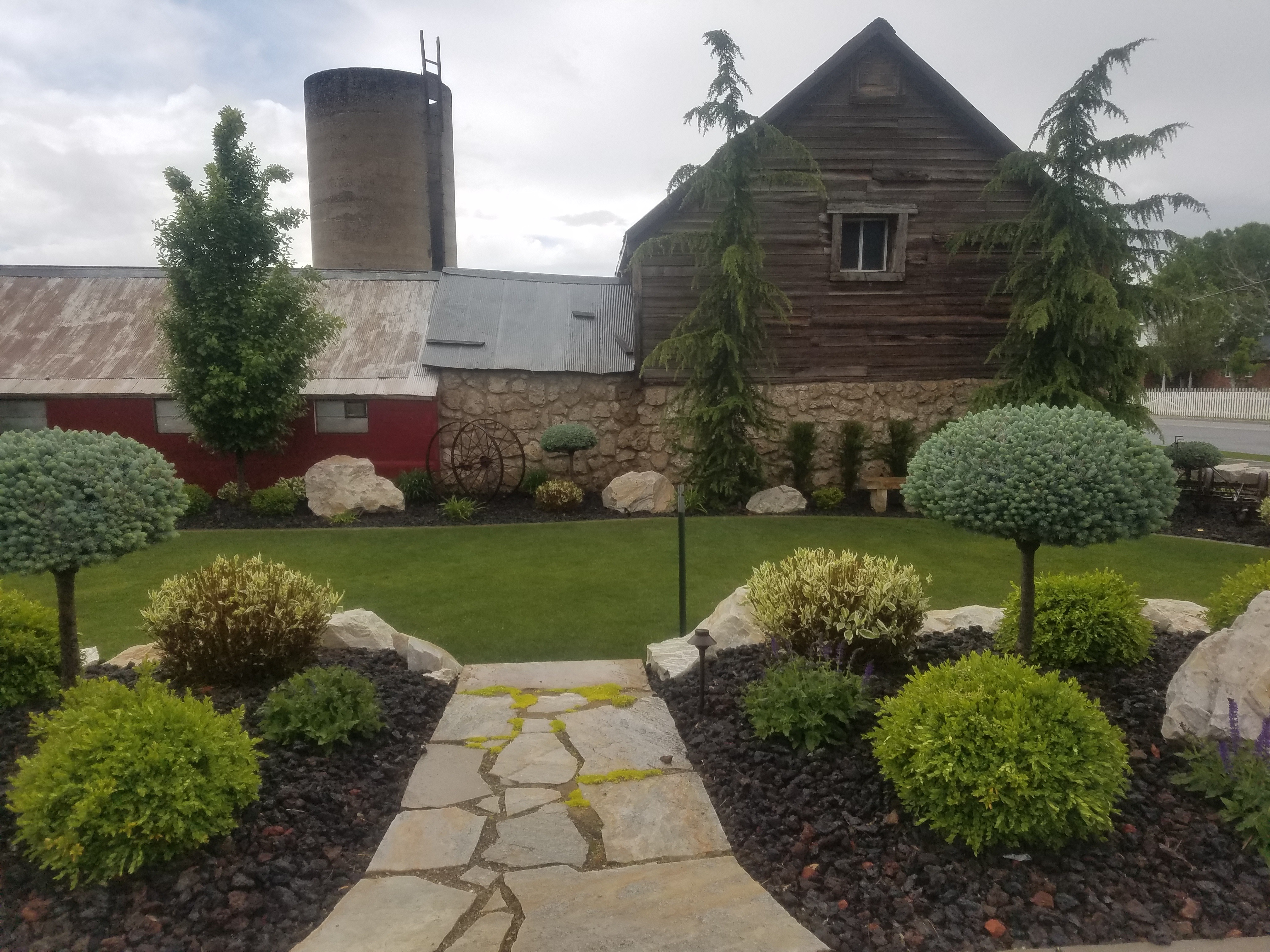
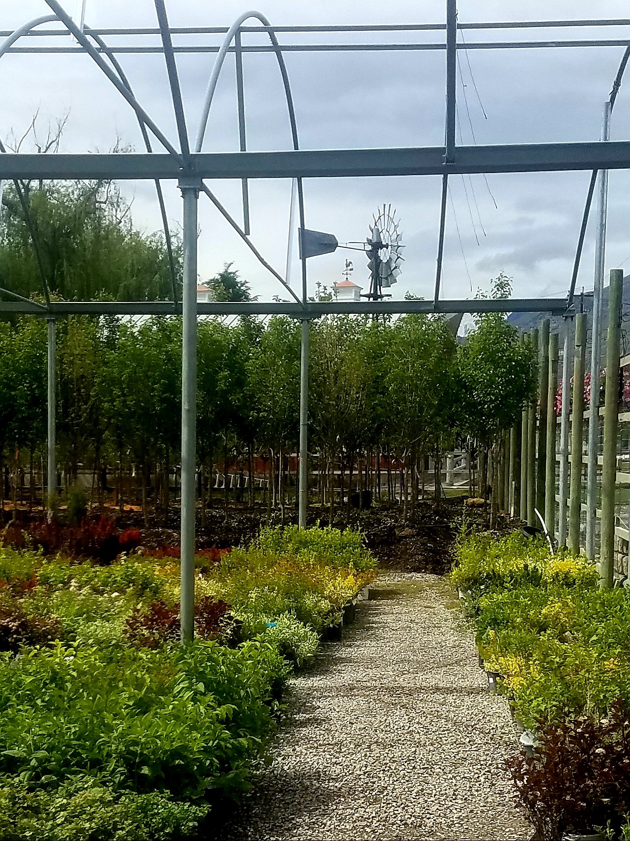
In the photographs I took to mimic the original, I tried to make sure I had very distinct Leading Lines in each picture. In photo #1, my goal was to show the distinct path into the nursery, with greenery on either side. I liked the wooden beams in this photo because I felt they mimicked the bamboo in the original photo. In photo #2, I just loved the structure of the barn and the distinct path leading the eye to it. I also loved how the beautiful plants and trees brought in the greenery/seed aspect to the photo. The rock on the wall and the weathered look of the wood on the side of the barn all gave me the same rustic vibe as the original photo. Photo #3 is my favorite of all three of my photos as the one that most mimics the original. The leading line path is similar and I tried to shoot it from the same angle as the original. The pole structure and the greenery feel like a close match to me. Lighting was a bit of a problem for me as we have had no sun all week, but overall I was happy with how the photos turned out.

Conclusion:

I enjoyed studying this magazine layout, because I was excited to find it covered the design principles we have been learning about this week. There were two different typefaces in the article that followed precise rules of which type works together as contrasting and not conflicting. Each of the photos had an element of good photography composition rules, such as, Leading Lines, Rule of Thirds, or Depth of Field. I was excited to see that this particular layout followed the good design principles so carefully.

Dior Ad Reverse Design

I have chosen to do a design critique on a Christian Dior ad featuring Natalie Portman that I came across in a Google search. I found the design very simple but I could see all of the elements of good design as well. I also thought it would be fun to recreate a mimic design of my own. I struggled to find the name for the designer of this particular ad, but Dior’s creative director is Maria Grazia Chirui.

https://makeupview.co/dior-makeup-ad/

The Contrast in this ad is very definite. There is not much color so the black hat against the white and gray background are a very stark visual effect. The shadow on the forehead is also contrasted by the lightness of her skin.

The Repetition I see in this ad is created by the fingernails and the lids of the mascara tube being the exact same color and having the same shine effect. Natalie’s eyelashes are defined enough that I can see some repetition there as well.

I feel the Alignment in this ad is interesting because although the model’s body is mostly center aligned, her face and hat are at the left side of the page. The typography is center aligned and the mascara is on the right. I think because the bulk of the ad is to the left the other elements pop out and make more of an impression.

The design element of Proximity in this ad is shown by how the text is located in one place all together. The mascara tube is right there with the text and by keeping these elements together, the face/eyelashes become the focal point, and the eye knows immediately that this is a mascara ad for Dior mascara. There is no need to have to scan the ad for the information over and over.

The Color is subtle and soft in this ad. Of course there is a basic black and white element with the text, hat and mascara tube, but then we have a beautiful,creamy pink in the model’s cheeks and on her lips. The metallic gray in the background and on the nails and lipstick tube are a more dramatic, icy, yet still soft color. There is also the brown in her hair, on the shadows of the skin and in her eyebrows and eyelashes.

The Typography in this ad follows the good elements of design by using both a serif font for the first part of the text and then including a sans serif font for the last line in the text.

I had some fun trying to mimic the original Dior ad by using a photo I had taken of my daughter at her 16th birthday party. We had a roaring 20’s murder mystery party and I happened to snap a quick photo of her all done up with hair and makeup. I thought it was a perfect photo to include in my copycat ad.

We have elements of Contrast in this ad by the pops of black and white throughout the ad. There is the contrast of the dusty rose color on her lips and the darker brown on her eyes and in the background. There is great contrast between the black and gold on her dress.

There is Repetition in my ad by my choice of colors. I repeated the rosy pink color throughout and used the brownish gold color from the perfume bottle and on her dress as part of my background. The waves in her hair create a natural repetition in the ad.

I chose to use right Alignment for the pic and for the Dior logo. I placed the perfume bottle on the right side with the bulk of the text in the middle to mimic the original ad.

I chose to place the Dior logo on top of the pic to keep the eye looking at one point, mostly her face. Keeping it in close Proximity allows me to see the model and know it is a Dior ad all at once. The rest of the text and the perfume are also in close proximity so there is no doubt what is being offered and by whom.

Like the original ad, I chose a soft, warmer Color palette. I pulled the soft pink color from the perfume bottle and used it as part of my background and in the Pure Poison text. This color happened to closely match the color on my daughter’s skin. The darker brown in her hair and in the background add to the warmth of the photo, but I feel the gold on her dress kind of mimics the metallic gray in the original photo and ads a just a touch of a cooler element.

I carefully chose my Typography to match as closely as I could to the original text, using a serif font for the bulk of the text. Like the original, for the smaller text I used a sans serif font. I had a little fun finding a font for the Pure Poison text. Not an exact match to the one on the bottle, but I liked the feel of it anyway.

Overall, I had a fun time trying to copycat the original Dior ad. Not being a professional photographer I knew my photo may not give me the quality I could get from other photos, but using my daughter’s face made it more personal and more enjoyable, and I worked hard to make sure I used all of the design elements I have been learning about.

Dylan Poster Design Elements

This poster of the musician Bob Dylan was created by artist, Milton Glaser. Mr. Glaser was commissioned to design a poster to be included in an album that Dylan released in 1966. The poster was included to generate more interest in the album itself. I have chosen it as my art piece for this reverse engineering assignment. I found the piece on a google search that directed me to the site below.
https://www.miltonglaser.com/store/c:posters/824/dylan-reproduction-2008

Proximity

Glaser makes use of the design element of proximity by placing the brighter colors close together. The eye sees the colors in the hair first by then is immediately drawn to the Dylan text.

Alignment

The image on the poster is right aligned and leaves interesting white space to the left. It is also interesting to see the hair aligning with the Dylan text below.

Repetition

Repetition is used in this piece by all of the shapes in the hair. Shape patterns repeat along with the color patterns. I also feel that the text itself is colorful and reminiscent of the shapes in the hair.

Contrast

There is so much contrast in this piece. The simple black and white elements are very striking but then there is the stark contrast of all of the bright colors as well.

Color

Mr. Glaser has made a very interesting use of color in this piece. He starts out with plain black on white for his background, but then adds a intriguing design dead center with bright colors. He also pulls in the prominent red color in the Dylan text. The colors chosen, I believe, are a very 60’s stylistic choice.

Conclusion

I find this piece very interesting to look at and feel the designer captured the movement of the 60’s era very well. All of the elements of good design are present and I have enjoyed visually dissecting it.